
Let me be clear that both LTC Tony Shaffer and GEN Jack Keane gave an accurate military analysis of what’s going on with the Russian airstrikes, but Shaffer was on Megyn Kelly last night and Kelly went on and on about the Russians hitting targets other than ISIS, which is the Obama administration narrative. Shaffer explained the true nature of the targets and laid out the Russian moves objectively. GEN Keane, likewise explained the military moves objectively with Chris Wallace on Sunday. Look at both maps in the background, both from the Institute for the Study of War. The map on the Kelly show has that entire rebel area where the bulk of the strikes occurred as solid yellow which is the rebel controlled area, not ISIS. The map with General Keane shows ISIS areas in green ISIS-controlled areas within that yellow rebel zone and the largest Russian target area is a green area to the north of the regime-controlled area. The Kelly show is the more recent aired show with the less accurate map – why?
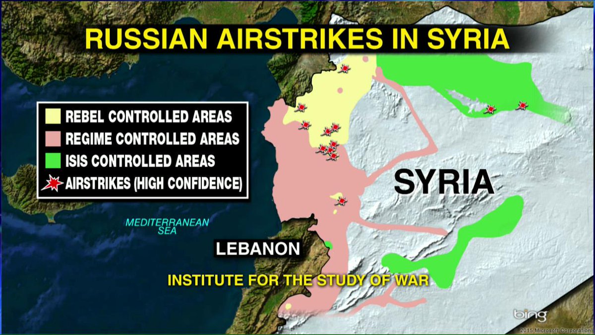
Image from Megyn Kelly’s Twitter- https://twitter.com/megynkelly/status/651207283574083584

Image from http://politibrew.com/politics/3298-general-jack-keane-how-russian-airstrikes-will-impact-region

It would appear the Murdoch-Ailes network “prefers”[?] not to recognize a distinction between al-Nusrah and the “moderates” on the Kelly show while, on the Wallace show the same network fails to recognize “a difference” between al-Nusrah and ISIS.
“Why” indeed.
Both maps are from the Institute for the Study of War run by Kimberly Kagan (the former employer of Elizabeth O’Bagy). General Keane is chairman of the board for the ISW. This reminds me of that ISW map that O’Bagy presented in 2013 to promote arming the “Syrian moderates”. Same old, same old.
Looks like we were typing in near unison LB. Thinking maybe too.
I missed the Wallace show LB. I notice the Keane map legend sports the brown and yellow striped regions (south of Homs and east of Homs/Hama) as contested among ISIS, JN – which I assume means Jubhat al-Nusra – and the Rebels (which I further suppose to mean the moderates) …
… would that be correct?
If so the ISW needs to go back to the drawing board and the palette (perhaps pink and blue might be nice) and fill in the green space just north of Hama with the pink and blue.
The green space west of Aleppo is fine except for the verymost north and west smidgen because that would be some Kurds.
Wallace show on Sunday with a more detailed ISW map.
Kelly show on Monday with a much less-detailed map that fed the Obama narrative.
Thanks for the updates, btw. I hope that the ISW is not the only map source again. In 2013 everyone used the ISW map on the “Syrian moderates” to include the media, the State Department and John McCain.
Maps become dated and can give erroneous information, especially in a war. When my husband went to Grenada with the 82nd they acquired tourist maps there, because they needed maps (take that to mean they needed some maps). My husband and his friends, as with soldier dark humor always, found it hysterically funny that as they were being shot at, the map’s “Grenada At A Glance” described the population:
“120,000 warm and friendly people.”
Maybe, I’ll scan that map info and post it, lol.
Sorry. Pink is Assad.
Whichever of the yellowish or brown represents Jubhat al-Nusrah that color and yellow.
Red is already taken because of the airstrikes. And white too I guess.
C’mon LB, you’re the crafter around these parts – which color for the Kurds would be the best so not to clash with Keane’s suit, his pointer, or the map and still look good on TV?
Red polka dots on a white background perhaps – just joking…. Or a white elephant print on a black background would be nice…. or since it’s the Arab world, maybe white camels….
Pingback: We still have The Constitution as our rule of law! | libertybelle diaries
Pingback: Loose threads | libertybelle diaries
Pingback: The Russian Big Picture (Part 1) | libertybelle diaries